Lenner
passion project
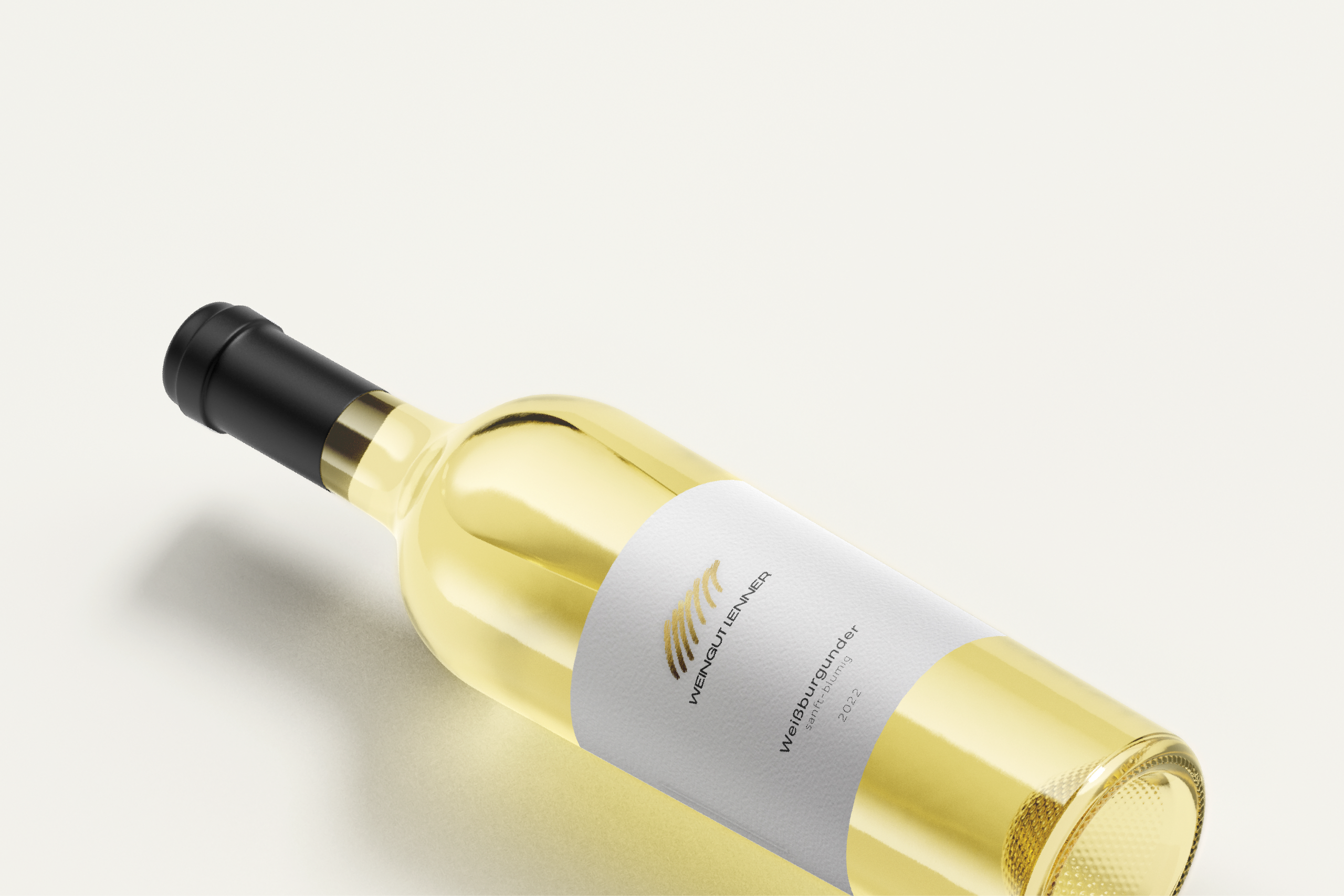
The branding for Weingut Lenner draws inspiration from the golden vineyards of Southern Styria (Südsteiermark), encapsulating the heritage and passion behind the winemaking process. At the core of the identity is a minimalist logo resembling stylized vine rows, rendered in a gradient gold texture that evokes both the topography of the vineyard landscape and the richness of the wine itself.
The label design is elegant and modern, combining a clean bright background with fine typography to highlight the premium character of the wine. Subtle embossing and gold foil stamping on the logo elevate the tactile and visual experience, reinforcing the sense of exclusivity.
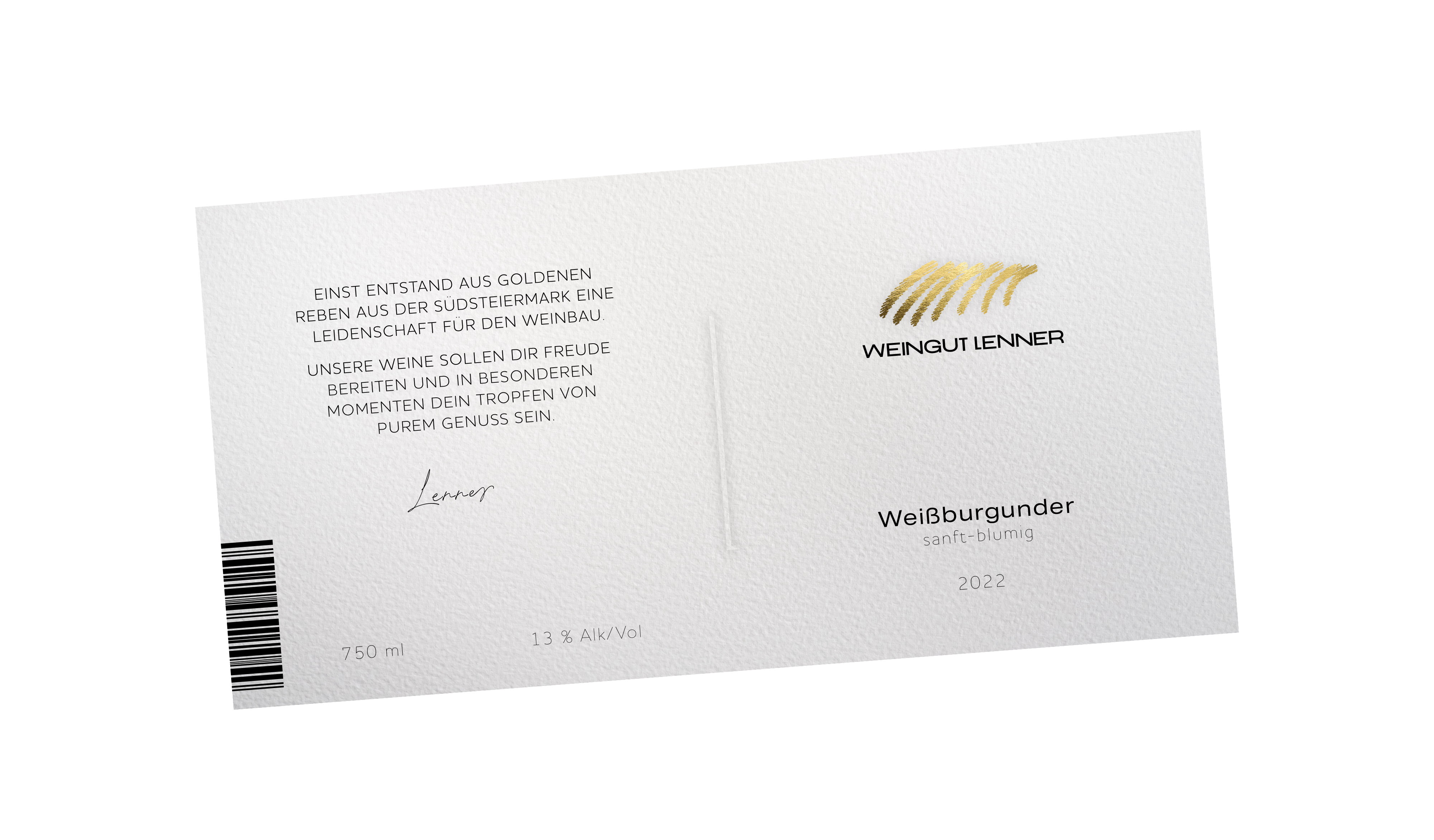
The back label features a short story that expresses the brand’s values: joy, authenticity, and the celebration of special moments. The layout is clear and structured, maintaining a sense of refinement and trustworthiness.
This concept balances tradition with contemporary aesthetics, positioning Weingut Lenner as a high-quality, emotionally resonant wine brand rooted in its regional identity.

“Once inspired by golden vines in the hills of Southern Styria, a deep passion for winemaking was born. Our wines are meant to bring you joy and to be your drop of pure pleasure in special moments.”